library(ggplot2)
library(dplyr)
library(ggrepel)
# 모델 유형별 데이터
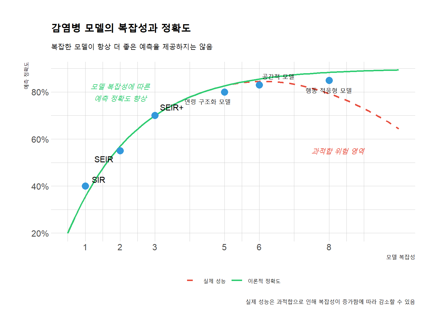
model_types <- data.frame(
complexity = c(1, 2, 3, 5, 6, 8),
accuracy = c(0.4, 0.55, 0.7, 0.8, 0.83, 0.85),
type = c("SIR", "SEIR", "SEIR+", "연령 구조화 모델", "공간적 모델", "행동 적응형 모델"),
features = c("기본 감염-회복 역학",
"잠복기 추가",
"무증상 감염자 추가",
"연령별 취약성과 접촉 패턴",
"지역 간 이동과 공간적 이질성",
"행동 변화와 정책 대응의 피드백 루프")
)
# 과적합 곡선 데이터
x_curve <- seq(0.5, 10, length.out = 100)
accuracy_curve <- 0.9 * (1 - exp(-0.5 * x_curve))
overfitting_curve <- 0.9 * (1 - exp(-0.5 * x_curve)) - (0.3 * pmax(0, x_curve - 5)^2 / 30)
curve_data <- data.frame(
complexity = c(x_curve, x_curve),
accuracy = c(accuracy_curve, overfitting_curve),
dataset = rep(c("이론적 정확도", "실제 성능"), each = length(x_curve))
)
# 그래프 그리기
ggplot() +
# 곡선
geom_line(data = curve_data,
aes(x = complexity, y = accuracy, linetype = dataset, color = dataset),
size = 1) +
# 모델 유형
geom_point(data = model_types,
aes(x = complexity, y = accuracy),
size = 4, color = "#3498db") +
# 모델 레이블
geom_text_repel(data = model_types,
aes(x = complexity, y = accuracy, label = type),
box.padding = 0.5, point.padding = 0.5,
force = 2, seed = 42) +
# 라벨과 제목
labs(title = "감염병 모델의 복잡성과 정확도",
subtitle = "복잡한 모델이 항상 더 좋은 예측을 제공하지는 않음",
x = "모델 복잡성",
y = "예측 정확도",
caption = "실제 성능은 과적합으로 인해 복잡성이 증가함에 따라 감소할 수 있음") +
scale_color_manual(values = c("이론적 정확도" = "#2ecc71", "실제 성능" = "#e74c3c")) +
scale_linetype_manual(values = c("이론적 정확도" = "solid", "실제 성능" = "dashed")) +
scale_x_continuous(breaks = c(1, 2, 3, 5, 6, 8)) +
scale_y_continuous(labels = scales::percent) +
theme_ipsum_rc() +
theme(legend.position = "bottom",
legend.title = element_blank(),
plot.title = element_text(face = "bold", size = 16),
plot.subtitle = element_text(size = 12),
axis.title = element_text(size = 12)) +
# 주석
annotate("text", x = 7.5, y = 0.55,
label = "과적합 위험 영역",
color = "#e74c3c", fontface = "italic", hjust = 0) +
annotate("text", x = 2, y = 0.8,
label = "모델 복잡성에 따른\n예측 정확도 향상",
color = "#2ecc71", fontface = "italic")